Thursday, April 24, 2025
Data Table & Forms Component Documentation
Posted by
Data Table & Forms Component Documentation
This guide provides comprehensive instructions on how to integrate and use the DataTable component system in both Next.js React applications and Laravel-React applications.
Table of Contents
- Overview
- Installation
- Basic Implementation
- Component Architecture
- Customizing the Data Table
- Working with Forms
- Integration with Laravel
- Advanced Usage
- Troubleshooting
Overview
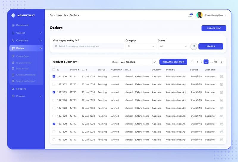
The DataTable system provides a comprehensive solution for displaying, filtering, and managing tabular data with built-in functionality for:
- Pagination
- Search filtering
- Date range filtering
- Row actions (edit, delete, view)
- Form handling for creating and editing items
- Confirmation dialogs
- Export to Excel
- Loading states
Installation
For Next.js Projects
-
Copy all the component files to your project:
components/ui/data-table/(all files)- Related UI components (button, input, etc.)
-
Install required dependencies:
npm install date-fns react-hook-form zod @hookform/resolvers xlsx lucide-react clsx
# For Next.js specific functionality
npm install next-auth
For Laravel-React Projects
- Copy the component files to your React src directory
- Install dependencies:
npm install date-fns react-hook-form zod @hookform/resolvers xlsx lucide-react clsx
Basic Implementation
Here's a simple example of how to implement the DataTable component with dummy data:
import { useState } from "react";
import { DataTable, Column } from "@/components/ui/data-table";
import { BriefItemDTO } from "@/types/item";

// Sample dummy data
const briefItems: BriefItemDTO[] = [
  {
    id: "item-001",
    name: "Leather Messenger Bag",
    slug: "leather-messenger-bag",
    sellingPrice: 129.99,
    costPrice: 75.5,
    salesCount: 243,
    salesTotal: 31587.57,
    createdAt: new Date("2024-12-15T09:30:00Z"),
    thumbnail: "https://images.unsplash.com/photo-1548036328-c9fa89d128fa",
  },
  // Add more items as needed
];

export default function SimpleItemListing() {
  // Define columns for the data table
  const columns: Column<BriefItemDTO>[] = [
    {
      header: "Image",
      accessorKey: "thumbnail",
      cell: (row) => (
        <img
          className="w-10 h-10"
          src={row.thumbnail ?? "/placeholder.png"}
          alt={row.name}
        />
      ),
    },
    {
      header: "Name",
      accessorKey: "name",
    },
    {
      header: "Price",
      accessorKey: "sellingPrice",
    },
    {
      header: "Sales Count",
      accessorKey: "salesCount",
    },
  ];

  // Handle row actions
  const handleEditClick = (item: BriefItemDTO) => {
    console.log("Edit item:", item);
  };

  const handleDeleteClick = (item: BriefItemDTO) => {
    console.log("Delete item:", item);
  };

  return (
    <DataTable<BriefItemDTO>
      title="Inventory Items"
      data={briefItems}
      columns={columns}
      keyField="id"
      filters={{
        searchFields: ["name"],
        enableDateFilter: true,
        getItemDate: (item) => item.createdAt,
      }}
      renderRowActions={(item) => (
        <TableActions.RowActions
          onEdit={() => handleEditClick(item)}
          onDelete={() => handleDeleteClick(item)}
        />
      )}
    />
  );
}
Component Architecture
The DataTable system is composed of several interconnected components:
- DataTable - Main component that renders the table with pagination
- FilterBar - Manages search and date filters
- TableActions - Provides action buttons for CRUD operations
- EntityForm - Handles forms for creating/editing items
- ConfirmationDialog - Confirms destructive actions
- TableLoading - Displays loading state
Key interfaces:
// The main column definition interface
export interface Column<T> {
  header: string;
  accessorKey: keyof T | ((row: T) => any);
  cell?: (row: T) => ReactNode;
}

// Sample item interface
export interface BriefItemDTO {
  id: string;
  name: string;
  slug: string;
  sellingPrice: number;
  costPrice: number;
  salesCount: number;
  salesTotal: number;
  createdAt: Date;
  thumbnail: string | null;
}
Customizing the Data Table
Adding Custom Columns
Columns are defined using the Column<T> interface. You can customize how data is displayed using the cell property:
const columns: Column<BriefItemDTO>[] = [
  {
    header: "Price",
    accessorKey: "sellingPrice",
    cell: (row) => (
      <span className="font-bold">${row.sellingPrice.toFixed(2)}</span>
    ),
  },
  // Add more columns
];
Custom Filtering
The DataTable supports search filtering and date filtering out of the box:
<DataTable<BriefItemDTO>
  // Other props
  filters={{
    searchFields: ["name", "slug"], // Fields to search
    enableDateFilter: true,
    getItemDate: (item) => item.createdAt,
    additionalFilters: <YourCustomFilterComponent />,
  }}
/>
Exporting Data
The DataTable provides built-in export functionality to Excel:
// In your component
const handleExport = (filteredData: BriefItemDTO[]) => {
  // This function is called when the export button is clicked
  // You can customize the export format if needed
};

<DataTable
  // Other props
  actions={{
    onExport: handleExport,
  }}
/>;
Working with Forms
Creating New Items
const [formDialogOpen, setFormDialogOpen] = useState(false);
const [currentItem, setCurrentItem] = useState<BriefItemDTO | null>(null);

// Form schema using zod
const itemFormSchema = z.object({
  name: z.string().min(1, "Name is required"),
  sellingPrice: z.string().min(1, "Price is required"),
  costPrice: z.string().min(1, "Cost price is required"),
  sku: z.string().min(1, "SKU is required"),
});

// Create form using react-hook-form
const form = useForm<ItemCreateDTO>({
  resolver: zodResolver(itemFormSchema),
  defaultValues: {
    name: "",
    sellingPrice: 0,
    costPrice: 0,
    sku: "",
  },
});

// Handle form submission
const onSubmit = async (data: ItemCreateDTO) => {
  // Handle form submission (create new item)
  console.log("Submitting form data:", data);
  // Close the form dialog after submission
  setFormDialogOpen(false);
};

// Rendering the entity form
<EntityForm
  open={formDialogOpen}
  onOpenChange={setFormDialogOpen}
  title="Add New Item"
  form={form}
  onSubmit={onSubmit}
  submitLabel="Add Item"
>
  {/* Form fields */}
  <FormField
    control={form.control}
    name="name"
    render={({ field }) => (
      <FormItem>
        <FormLabel>Item Name</FormLabel>
        <FormControl>
          <Input placeholder="Enter item name" {...field} />
        </FormControl>
        <FormMessage />
      </FormItem>
    )}
  />

  {/* Additional form fields */}
</EntityForm>;
Handling Item Deletion
const [deleteDialogOpen, setDeleteDialogOpen] = useState(false);
const [itemToDelete, setItemToDelete] = useState<BriefItemDTO | null>(null);

// Handle delete button click
const handleDeleteClick = (item: BriefItemDTO) => {
  setItemToDelete(item);
  setDeleteDialogOpen(true);
};

// Handle confirm delete
const handleConfirmDelete = () => {
  if (itemToDelete) {
    // Delete the item
    console.log("Deleting item:", itemToDelete);
    setDeleteDialogOpen(false);
  }
};

// Render confirmation dialog
<ConfirmationDialog
  open={deleteDialogOpen}
  onOpenChange={setDeleteDialogOpen}
  title="Delete Item"
  description={
    itemToDelete ? (
      <>
        Are you sure you want to delete <strong>{itemToDelete.name}</strong>?
        This action cannot be undone.
      </>
    ) : (
      "Are you sure you want to delete this item?"
    )
  }
  onConfirm={handleConfirmDelete}
  confirmLabel="Delete"
  variant="destructive"
/>;
Integration with Laravel
Setting Up API Endpoints
For Laravel backend integration, you'll need to set up API endpoints:
- Create routes in your Laravel
routes/api.php:
// routes/api.php
Route::middleware('auth:sanctum')->group(function () {
    Route::get('/items', [ItemController::class, 'index']);
    Route::post('/items', [ItemController::class, 'store']);
    Route::put('/items/{id}', [ItemController::class, 'update']);
    Route::delete('/items/{id}', [ItemController::class, 'destroy']);
});
- Create a controller to handle these routes:
// app/Http/Controllers/ItemController.php
namespace App\Http\Controllers;

use App\Models\Item;
use Illuminate\Http\Request;

class ItemController extends Controller
{
    public function index(Request $request)
    {
        $orgId = $request->input('org_id');
        $items = Item::where('org_id', $orgId)->get();

        return response()->json([
            'items' => $items
        ]);
    }

    public function store(Request $request)
    {
        $validated = $request->validate([
            'name' => 'required|string',
            'sellingPrice' => 'required|numeric',
            'costPrice' => 'required|numeric',
            'sku' => 'required|string',
            'org_id' => 'required|string',
            'thumbnail' => 'nullable|string'
        ]);

        $item = Item::create($validated);

        return response()->json([
            'message' => 'Item created successfully',
            'item' => $item
        ], 201);
    }

    // Implement update and destroy methods
}
Fetching Data from Laravel API
// hooks/useItemQueries.ts
import { useState, useEffect } from "react";
import axios from "axios";
import { BriefItemDTO } from "@/types/item";

export function useOrgItems(orgId: string) {
  const [items, setItems] = useState<BriefItemDTO[]>([]);
  const [isLoading, setIsLoading] = useState(true);
  const [error, setError] = useState<Error | null>(null);

  const fetchItems = async () => {
    setIsLoading(true);
    try {
      const response = await axios.get(`/api/items?org_id=${orgId}`);
      setItems(response.data.items);
    } catch (err) {
      setError(err instanceof Error ? err : new Error("Unknown error"));
    } finally {
      setIsLoading(false);
    }
  };

  useEffect(() => {
    fetchItems();
  }, [orgId]);

  return {
    items,
    isLoading,
    error,
    refetch: fetchItems,
  };
}

// Implement other methods (create, update, delete)
Advanced Usage
Complete ItemListing Component
Here's a complete implementation of the ItemListing component with dummy data:
import { useState, useEffect } from "react";
import { format } from "date-fns";
import * as XLSX from "xlsx";
import { useForm } from "react-hook-form";
import { zodResolver } from "@hookform/resolvers/zod";
import { z } from "zod";
import { toast } from "sonner";
import { DollarSign } from "lucide-react";
import {
  DataTable,
  Column,
  TableActions,
  EntityForm,
  ConfirmationDialog,
} from "@/components/ui/data-table";
import {
  FormControl,
  FormField,
  FormItem,
  FormLabel,
  FormMessage,
  FormDescription,
} from "@/components/ui/form";
import { Input } from "@/components/ui/input";
import { BriefItemDTO } from "@/types/item";
import { Button } from "@/components/ui/button";
import Link from "next/link";

// Sample dummy data - use this instead of React Query
const briefItems: BriefItemDTO[] = [
  {
    id: "item-001",
    name: "Leather Messenger Bag",
    slug: "leather-messenger-bag",
    sellingPrice: 129.99,
    costPrice: 75.5,
    salesCount: 243,
    salesTotal: 31587.57,
    createdAt: new Date("2024-12-15T09:30:00Z"),
    thumbnail: "https://images.unsplash.com/photo-1548036328-c9fa89d128fa",
  },
  {
    id: "item-002",
    name: "Wireless Noise-Canceling Headphones",
    slug: "wireless-noise-canceling-headphones",
    sellingPrice: 249.99,
    costPrice: 149.99,
    salesCount: 518,
    salesTotal: 129494.82,
    createdAt: new Date("2024-11-03T14:45:00Z"),
    thumbnail: "https://images.unsplash.com/photo-1505740420928-5e560c06d30e",
  },
  // Add more items as needed
];

interface ItemListingProps {
  title: string;
  orgId: string;
}

// Form schema for editing/adding products
const productFormSchema = z.object({
  name: z.string().min(1, "Name is required"),
  sellingPrice: z.string().min(1, "Price is required"),
  costPrice: z.string().min(1, "Cost price is required"),
  sku: z.string().min(1, "SKU is required"),
});

type ProductFormValues = z.infer<typeof productFormSchema>;

// For dummy implementation
interface ItemCreateDTO {
  name: string;
  sellingPrice: number;
  costPrice: number;
  sku: string;
  orgId?: string;
  thumbnail?: string | null;
}

export default function ItemListing({ title, orgId }: ItemListingProps) {
  // Local state for dummy data (replace with API calls in production)
  const [items, setItems] = useState<BriefItemDTO[]>(briefItems);
  const [isLoading, setIsLoading] = useState(false);

  // For create/update mutations
  const createItem = (data: ItemCreateDTO) => {
    // Create a new item with generated ID
    const newItem: BriefItemDTO = {
      id: `item-${Date.now()}`,
      name: data.name,
      slug: data.name.toLowerCase().replace(/\s+/g, "-"),
      sellingPrice: Number(data.sellingPrice),
      costPrice: Number(data.costPrice),
      salesCount: 0,
      salesTotal: 0,
      createdAt: new Date(),
      thumbnail: data.thumbnail || null,
    };

    setItems([...items, newItem]);
    toast.success("Item created successfully");
  };

  const deleteItem = (id: string) => {
    setItems(items.filter((item) => item.id !== id));
    toast.success("Item deleted successfully");
  };

  // Refetch function for dummy data
  const refetch = () => {
    setIsLoading(true);
    // Simulate API delay
    setTimeout(() => {
      setIsLoading(false);
    }, 500);
  };

  // Local state
  const [imageUrl, setImageUrl] = useState(
    "https://images.unsplash.com/photo-1548036328-c9fa89d128fa"
  );
  const [formDialogOpen, setFormDialogOpen] = useState(false);
  const [deleteDialogOpen, setDeleteDialogOpen] = useState(false);
  const [isExporting, setIsExporting] = useState(false);
  const [currentProduct, setCurrentProduct] = useState<BriefItemDTO | null>(
    null
  );
  const [productToDelete, setProductToDelete] = useState<BriefItemDTO | null>(
    null
  );

  // Form for editing/adding products
  const form = useForm<ItemCreateDTO>({
    resolver: zodResolver(productFormSchema),
    defaultValues: {
      name: "",
      sellingPrice: 0,
      costPrice: 0,
      sku: "",
    },
  });

  // Update form when current product changes
  useEffect(() => {
    if (!currentProduct) {
      // Adding new - reset form
      form.reset({
        name: "",
        sellingPrice: 0,
        costPrice: 0,
        sku: "",
      });
    } else {
      // Editing existing - populate form
      form.reset({
        name: currentProduct.name,
        sellingPrice: currentProduct.sellingPrice,
        costPrice: currentProduct.costPrice,
        sku: "", // Assume SKU isn't in the BriefItemDTO
      });
    }
  }, [currentProduct, form]);

  // Format date function
  const formatDate = (date: Date | string) => {
    const dateObj = typeof date === "string" ? new Date(date) : date;
    return format(dateObj, "MMM dd, yyyy");
  };

  // Format currency
  const formatCurrency = (amount: number) => {
    return new Intl.NumberFormat("en-UG", {
      style: "currency",
      currency: "UGX",
      minimumFractionDigits: 0,
    }).format(amount);
  };

  // Export to Excel
  const handleExport = async (filteredProducts: BriefItemDTO[]) => {
    setIsExporting(true);
    try {
      // Prepare data for export
      const exportData = filteredProducts.map((product) => ({
        Name: product.name,
        Price: product.sellingPrice,
        "Sales Count": product.salesCount,
        "Total Sales": formatCurrency(product.salesTotal),
        "Date Added": formatDate(product.createdAt),
      }));

      // Create workbook and worksheet
      const worksheet = XLSX.utils.json_to_sheet(exportData);
      const workbook = XLSX.utils.book_new();
      XLSX.utils.book_append_sheet(workbook, worksheet, "Products");

      // Generate filename with current date
      const fileName = `Products_${format(new Date(), "yyyy-MM-dd")}.xlsx`;

      // Export to file
      XLSX.writeFile(workbook, fileName);

      toast.success("Export successful", {
        description: `Products exported to ${fileName}`,
      });
    } catch (error) {
      toast.error("Export failed", {
        description:
          error instanceof Error ? error.message : "Unknown error occurred",
      });
    } finally {
      setIsExporting(false);
    }
  };

  // Handle add new click
  const handleAddClick = () => {
    setCurrentProduct(null);
    setFormDialogOpen(true);
  };

  // Handle edit click
  const handleEditClick = (product: BriefItemDTO) => {
    // For demo purposes, we're just showing the form
    setCurrentProduct(product);
    setFormDialogOpen(true);
  };

  // Handle delete click
  const handleDeleteClick = (product: BriefItemDTO) => {
    setProductToDelete(product);
    setDeleteDialogOpen(true);
  };

  // Handle form submission (edit or add)
  const onSubmit = async (data: ItemCreateDTO) => {
    if (!currentProduct) {
      // Add new product
      data.costPrice = Number(data.costPrice);
      data.sellingPrice = Number(data.sellingPrice);
      data.orgId = orgId;
      data.thumbnail = imageUrl;
      createItem(data);
      setFormDialogOpen(false);
      form.reset();
    } else {
      // Edit existing product (not implemented in this example)
      toast.success("Item updated successfully");
      setFormDialogOpen(false);
    }
  };

  // Handle confirming delete
  const handleConfirmDelete = () => {
    if (productToDelete) {
      deleteItem(productToDelete.id);
      setDeleteDialogOpen(false);
      setProductToDelete(null);
    }
  };

  // Calculate total products value
  const getTotalValue = (products: BriefItemDTO[]) => {
    return products.reduce((total, product) => {
      const price = product.sellingPrice;
      return total + price;
    }, 0);
  };

  // Define columns for the data table
  const columns: Column<BriefItemDTO>[] = [
    {
      header: "Image",
      accessorKey: "thumbnail",
      cell: (row) => (
        <img
          className="w-10 h-10"
          src={row.thumbnail ?? "/placeholder.png"}
          alt={row.name}
        />
      ),
    },
    {
      header: "Name",
      accessorKey: "name",
      cell: (row) => (
        <span className="font-medium line-clamp-1">
          {row.name.length > 20 ? `${row.name.substring(0, 20)}...` : row.name}
        </span>
      ),
    },
    {
      header: "Price",
      accessorKey: "sellingPrice",
    },
    {
      header: "Sales Count",
      accessorKey: "salesCount",
    },
    {
      header: "Total Sales",
      accessorKey: (row) => formatCurrency(row.salesTotal),
    },
    {
      header: "Suppliers",
      accessorKey: "id",
      cell: (row) => (
        <Button variant={"outline"}>
          <Link href={`/dashboard/inventory/items/${row.id}/suppliers`}>
            View Suppliers
          </Link>
        </Button>
      ),
    },
  ];

  // Generate subtitle with total value
  const getSubtitle = (productCount: number, totalValue: number) => {
    return `${productCount} ${
      productCount === 1 ? "item" : "items"
    } | Total Value: ${formatCurrency(totalValue)}`;
  };

  return (
    <>
      <DataTable<BriefItemDTO>
        title={title}
        subtitle={
          items.length > 0
            ? getSubtitle(items.length, getTotalValue(items))
            : undefined
        }
        data={items}
        columns={columns}
        keyField="id"
        isLoading={isLoading}
        onRefresh={refetch}
        actions={{
          onAdd: handleAddClick,
          onExport: handleExport,
        }}
        filters={{
          searchFields: ["name"],
          enableDateFilter: true,
          getItemDate: (item) => item.createdAt,
        }}
        renderRowActions={(item) => (
          <TableActions.RowActions
            onEdit={() => handleEditClick(item)}
            onDelete={() => handleDeleteClick(item)}
          />
        )}
      />

      {/* Product Form Dialog */}
      <EntityForm
        size="md"
        open={formDialogOpen}
        onOpenChange={setFormDialogOpen}
        title={currentProduct ? "Edit Item" : "Add New Item"}
        form={form}
        onSubmit={onSubmit}
        submitLabel={currentProduct ? "Save Changes" : "Add Item"}
      >
        <FormField
          control={form.control}
          name="name"
          render={({ field }) => (
            <FormItem>
              <FormLabel>Item Name</FormLabel>
              <FormControl>
                <Input placeholder="Enter item name" {...field} />
              </FormControl>
              <FormMessage />
            </FormItem>
          )}
        />

        <div className="grid gap-3 grid-cols-2">
          <FormField
            control={form.control}
            name="sellingPrice"
            render={({ field }) => (
              <FormItem>
                <FormLabel>Selling Price</FormLabel>
                <FormControl>
                  <div className="relative">
                    <DollarSign className="absolute left-2 top-2.5 h-4 w-4 text-muted-foreground" />
                    <Input
                      placeholder="25,000,000"
                      className="pl-8"
                      {...field}
                    />
                  </div>
                </FormControl>
                <FormDescription>
                  Enter the product price in UGX
                </FormDescription>
                <FormMessage />
              </FormItem>
            )}
          />
          <FormField
            control={form.control}
            name="costPrice"
            render={({ field }) => (
              <FormItem>
                <FormLabel>Cost Price</FormLabel>
                <FormControl>
                  <div className="relative">
                    <DollarSign className="absolute left-2 top-2.5 h-4 w-4 text-muted-foreground" />
                    <Input
                      placeholder="25,000,000"
                      className="pl-8"
                      {...field}
                    />
                  </div>
                </FormControl>
                <FormDescription>
                  Enter the product price in UGX
                </FormDescription>
                <FormMessage />
              </FormItem>
            )}
          />
        </div>
        <div className="grid grid-cols-12 gap-3">
          <div className="col-span-12">
            <FormField
              control={form.control}
              name="sku"
              render={({ field }) => (
                <FormItem>
                  <FormLabel>Item SKU</FormLabel>
                  <FormControl>
                    <div className="relative">
                      <DollarSign className="absolute left-2 top-2.5 h-4 w-4 text-muted-foreground" />
                      <Input placeholder="SKU-" className="pl-8" {...field} />
                    </div>
                  </FormControl>
                  <FormDescription>Enter the item SKU</FormDescription>
                  <FormMessage />
                </FormItem>
              )}
            />
          </div>
        </div>
      </EntityForm>

      {/* Delete Confirmation Dialog */}
      <ConfirmationDialog
        open={deleteDialogOpen}
        onOpenChange={setDeleteDialogOpen}
        title="Delete Product"
        description={
          productToDelete ? (
            <>
              Are you sure you want to delete{" "}
              <strong>{productToDelete.name}</strong>? This action cannot be
              undone.
            </>
          ) : (
            "Are you sure you want to delete this product?"
          )
        }
        onConfirm={handleConfirmDelete}
        confirmLabel="Delete"
        variant="destructive"
      />
    </>
  );
}
Troubleshooting
Common Issues
-
Missing Dependencies
- Ensure all required packages are installed
- Check import paths are correct for your project structure
-
Form Validation Errors
- Verify Zod schema matches your form fields
- Check that form field names match the schema
-
Integration with Laravel
- Ensure CSRF token is included in requests
- Check API routes are correctly defined
- Verify authentication middleware is properly configured
Performance Optimization
For large data sets, consider implementing:
- Server-side pagination - Modify the
useOrgItemshook to accept page and limit parameters - Memoization - Use React's
useMemofor expensive calculations - Virtual scrolling - For extremely large data sets
Update Form Implementation
The update form system provides a comprehensive, multi-tab approach to editing complex items. This section covers how to implement and use the ItemUpdateForm component in your application.
Structure of the Update Form
The update form is organized with a tabbed interface for better user experience:
- Basic Information - Core product details (name, SKU, description, etc.)
- Inventory & Pricing - Stock levels, prices, and status settings
- Additional Details - Secondary information like UPC, EAN, MPN, etc.
Implementation Steps
1. Create the Edit Page (Next.js example)
// app/dashboard/inventory/items/[id]/edit/page.tsx
import { notFound } from "next/navigation";
import { ItemUpdateForm } from "./item-update-form";
import { Button } from "@/components/ui/button";
import { ArrowLeft } from "lucide-react";
import Link from "next/link";
import { Suspense } from "react";
import EditItemLoading from "./edit-loading";

// Sample dummy data for a single item
const dummyItem = {
  id: "item-001",
  name: "Leather Messenger Bag",
  slug: "leather-messenger-bag",
  sku: "SKU-001",
  orgId: "org-001",
  description: "A stylish leather messenger bag for professionals",
  sellingPrice: 129.99,
  costPrice: 75.5,
  barcode: "1234567890",
  minStockLevel: 10,
  maxStockLevel: 100,
  salesCount: 243,
  salesTotal: 31587.57,
  createdAt: new Date("2024-12-15T09:30:00Z"),
  updatedAt: new Date("2025-01-10T14:22:33Z"),
  isActive: true,
  isSerialTracked: false,
  thumbnail: "https://images.unsplash.com/photo-1548036328-c9fa89d128fa",
  weight: 1.5,
  dimensions: "30x40x15cm",
  unitOfMeasure: "Each",
  upc: "012345678901",
  ean: "0123456789012",
  mpn: "MFG-001",
  isbn: "9781234567897",
  imageUrls: [
    "https://images.unsplash.com/photo-1548036328-c9fa89d128fa",
    "https://images.unsplash.com/photo-1548036328-c9fa89d128fa",
  ],
  tax: 18,
  taxRateId: "tax-001",
  unitId: "unit-001",
  brandId: "brand-001",
  categoryId: "category-001",
};

// Sample options for dropdowns
const categoryOptions = [
  { label: "Electronics", value: "category-001" },
  { label: "Clothing", value: "category-002" },
  { label: "Home Goods", value: "category-003" },
];

const brandOptions = [
  { label: "Apple", value: "brand-001" },
  { label: "Samsung", value: "brand-002" },
  { label: "Nike", value: "brand-003" },
];

const taxOptions = [
  { label: "Standard VAT-18", value: "tax-001" },
  { label: "Reduced VAT-5", value: "tax-002" },
  { label: "Zero Rate-0", value: "tax-003" },
];

const unitOptions = [
  { label: "Each-EA", value: "unit-001" },
  { label: "Kilogram-KG", value: "unit-002" },
  { label: "Liter-L", value: "unit-003" },
];

export default function EditItemPage({ params }: { params: { id: string } }) {
  // In a real app, you would fetch this data from your API
  const item = dummyItem;

  if (!item) {
    notFound();
  }

  return (
    <Suspense fallback={<EditItemLoading />}>
      <div className="container">
        <div className="mb-8 space-y-4">
          <div className="flex items-center gap-2">
            <Link href="/dashboard/inventory/items">
              <Button variant="ghost" size="icon" className="rounded-full">
                <ArrowLeft className="h-5 w-5" />
                <span className="sr-only">Back to items</span>
              </Button>
            </Link>
            <div className="text-sm text-muted-foreground">
              <Link
                href="/dashboard/inventory/items"
                className="hover:underline"
              >
                Items
              </Link>{" "}
              / <span>Edit</span>
            </div>
          </div>

          <div className="flex flex-col md:flex-row md:items-center justify-between gap-4">
            <div>
              <h1 className="text-3xl font-bold tracking-tight">{item.name}</h1>
              <p className="text-muted-foreground mt-1">
                SKU: {item.sku} • Last updated:{" "}
                {new Date(item.updatedAt).toLocaleDateString()}
              </p>
            </div>
            <div className="flex items-center gap-2">
              <Button variant="outline">Preview</Button>
            </div>
          </div>
        </div>

        <ItemUpdateForm
          brandOptions={brandOptions}
          categoryOptions={categoryOptions}
          unitOptions={unitOptions}
          taxOptions={taxOptions}
          item={item}
        />
      </div>
    </Suspense>
  );
}
2. Create the ItemUpdateForm Component
The main component that manages the tabbed interface:
// components/item-update-form.tsx
"use client";

import { useState } from "react";
import { Tabs, TabsContent, TabsList, TabsTrigger } from "@/components/ui/tabs";
import { BasicInfoTab } from "./tabs/basic-info-tab";
import { InventoryPricingTab } from "./tabs/inventory-pricing-tab";
import { AdditionalDetailsTab } from "./tabs/additional-details-tab";
import { cn } from "@/lib/utils";

export interface Option {
  label: string;
  value: string;
}

export interface ProductData {
  id: string;
  name: string;
  slug: string;
  sku: string;
  orgId: string;
  description?: string;
  sellingPrice: number;
  costPrice: number;
  barcode?: string;
  minStockLevel: number;
  maxStockLevel?: number;
  salesCount: number;
  salesTotal: number;
  createdAt: Date;
  updatedAt: Date;
  isActive: boolean;
  isSerialTracked: boolean;
  thumbnail?: string;
  weight?: number;
  dimensions?: string;
  unitOfMeasure?: string;
  upc?: string;
  ean?: string;
  mpn?: string;
  isbn?: string;
  imageUrls?: string[];
  tax?: number;
  taxRateId?: string;
  unitId?: string;
  brandId?: string;
  categoryId?: string;
}

export function ItemUpdateForm({
  item,
  brandOptions,
  categoryOptions,
  taxOptions,
  unitOptions,
}: {
  item: ProductData;
  categoryOptions: Option[];
  taxOptions: Option[];
  unitOptions: Option[];
  brandOptions: Option[];
}) {
  const [activeTab, setActiveTab] = useState("basic-info");

  return (
    <Tabs value={activeTab} onValueChange={setActiveTab} className="w-full">
      <TabsList className="w-full p-0 bg-transparent border-b rounded-none mb-6 relative">
        <div className="absolute bottom-0 left-0 right-0 h-0.5 bg-muted"></div>
        <TabsTrigger
          value="basic-info"
          className={cn(
            "py-3 px-6 rounded-none data-[state=active]:shadow-none relative",
            "data-[state=active]:text-primary data-[state=active]:font-medium",
            "after:absolute after:bottom-0 after:left-0 after:right-0 after:h-0.5 after:bg-primary after:scale-x-0 data-[state=active]:after:scale-x-100 after:transition-transform"
          )}
        >
          Basic Information
        </TabsTrigger>
        <TabsTrigger
          value="inventory-pricing"
          className={cn(
            "py-3 px-6 rounded-none data-[state=active]:shadow-none relative",
            "data-[state=active]:text-primary data-[state=active]:font-medium",
            "after:absolute after:bottom-0 after:left-0 after:right-0 after:h-0.5 after:bg-primary after:scale-x-0 data-[state=active]:after:scale-x-100 after:transition-transform"
          )}
        >
          Inventory & Pricing
        </TabsTrigger>
        <TabsTrigger
          value="additional-details"
          className={cn(
            "py-3 px-6 rounded-none data-[state=active]:shadow-none relative",
            "data-[state=active]:text-primary data-[state=active]:font-medium",
            "after:absolute after:bottom-0 after:left-0 after:right-0 after:h-0.5 after:bg-primary after:scale-x-0 data-[state=active]:after:scale-x-100 after:transition-transform"
          )}
        >
          Additional Details
        </TabsTrigger>
      </TabsList>

      <TabsContent value="basic-info">
        <BasicInfoTab
          brandOptions={brandOptions}
          categoryOptions={categoryOptions}
          item={item}
        />
      </TabsContent>

      <TabsContent value="inventory-pricing">
        <InventoryPricingTab
          unitOptions={unitOptions}
          taxOptions={taxOptions}
          item={item}
        />
      </TabsContent>

      <TabsContent value="additional-details">
        <AdditionalDetailsTab item={item} />
      </TabsContent>
    </Tabs>
  );
}
3. Implement the Tab Components
Each tab should be implemented as a separate component. Here's an example of the Basic Info tab:
// components/tabs/basic-info-tab.tsx
"use client";

import { useState } from "react";
import {
  Card,
  CardContent,
  CardFooter,
  CardHeader,
  CardTitle,
} from "@/components/ui/card";
import { Button } from "@/components/ui/button";
import { Input } from "@/components/ui/input";
import { Label } from "@/components/ui/label";
import { Textarea } from "@/components/ui/textarea";
import { toast } from "sonner";
import { ProductData, Option } from "../item-update-form";
import ImageUploadButton from "@/components/FormInputs/ImageUploadButton";

export function BasicInfoTab({
  item,
  brandOptions,
  categoryOptions,
}: {
  item: ProductData;
  categoryOptions: Option[];
  brandOptions: Option[];
}) {
  return (
    <div className="grid gap-6 mt-6">
      <NameSlugCard item={item} />
      <SkuBarcodeCard item={item} />
      <DescriptionDimensionsCard item={item} />
      {/* Additional cards... */}
    </div>
  );
}

function NameSlugCard({ item }: { item: ProductData }) {
  const [name, setName] = useState(item.name);
  const [slug, setSlug] = useState(item.slug);
  const [isUpdating, setIsUpdating] = useState(false);

  const handleUpdate = async () => {
    if (!name.trim()) {
      toast.error("Name is required");
      return;
    }

    if (!slug.trim()) {
      toast.error("Slug is required");
      return;
    }

    setIsUpdating(true);

    try {
      // In a real app, make an API call here
      await new Promise((resolve) => setTimeout(resolve, 500));
      toast.success("Name and slug updated successfully");
    } catch (error) {
      toast.error("Failed to update name and slug");
      console.error(error);
    } finally {
      setIsUpdating(false);
    }
  };

  return (
    <Card>
      <CardHeader>
        <CardTitle>Basic Details</CardTitle>
      </CardHeader>
      <CardContent className="grid gap-6">
        <div className="grid gap-3">
          <Label htmlFor="name">Name</Label>
          <Input
            id="name"
            value={name}
            onChange={(e) => setName(e.target.value)}
            placeholder="Product name"
          />
        </div>
        <div className="grid gap-3">
          <Label htmlFor="slug">Slug</Label>
          <Input
            id="slug"
            value={slug}
            onChange={(e) => setSlug(e.target.value)}
            placeholder="product-slug"
          />
        </div>
      </CardContent>
      <CardFooter>
        <Button onClick={handleUpdate} disabled={isUpdating}>
          {isUpdating ? "Updating..." : "Update Basic Details"}
        </Button>
      </CardFooter>
    </Card>
  );
}

// Additional card components...
4. Implement Loading State
Create a loading state for better user experience:
// components/edit-loading.tsx
import { Skeleton } from "@/components/ui/skeleton";
import { Button } from "@/components/ui/button";

export default function EditItemLoading() {
  return (
    <div className="container py-10 animate-pulse">
      {/* Header Section */}
      <div className="mb-8 space-y-4">
        <div className="flex items-center gap-2">
          <div className="h-9 w-9 rounded-full bg-muted"></div>
          <Skeleton className="h-4 w-32" />
        </div>

        <div className="flex flex-col md:flex-row md:items-center justify-between gap-4">
          <div>
            <Skeleton className="h-9 w-[450px] mb-2" />
            <Skeleton className="h-5 w-[300px]" />
          </div>
          <div className="flex items-center gap-2">
            <Button variant="outline" disabled>
              Preview
            </Button>
            <Button variant="default" disabled>
              Save All Changes
            </Button>
          </div>
        </div>
      </div>

      {/* Tabs */}
      <div className="w-full p-0 border-b rounded-none mb-6 relative">
        <div className="absolute bottom-0 left-0 right-0 h-0.5 bg-muted"></div>
        <div className="flex">
          <div className="py-3 px-6 relative">
            <Skeleton className="h-5 w-32" />
            <div className="absolute bottom-0 left-0 right-0 h-0.5 bg-primary"></div>
          </div>
          <div className="py-3 px-6">
            <Skeleton className="h-5 w-36" />
          </div>
          <div className="py-3 px-6">
            <Skeleton className="h-5 w-36" />
          </div>
        </div>
      </div>

      {/* Content */}
      <div className="grid gap-6 mt-6">
        {/* Basic Details Card */}
        <div className="border rounded-lg p-6 space-y-6">
          <div className="flex justify-between items-center">
            <Skeleton className="h-6 w-32" />
          </div>
          <div className="space-y-6">
            <div className="space-y-3">
              <Skeleton className="h-4 w-16" />
              <Skeleton className="h-10 w-full" />
            </div>
            <div className="space-y-3">
              <Skeleton className="h-4 w-16" />
              <Skeleton className="h-10 w-full" />
            </div>
          </div>
          <div className="pt-2">
            <Skeleton className="h-10 w-40" />
          </div>
        </div>

        {/* Additional skeleton cards... */}
      </div>
    </div>
  );
}
Integration with Laravel API
For Laravel integration, you'll need to create appropriate endpoints for fetching and updating items:
// routes/api.php
Route::middleware('auth:sanctum')->group(function () {
    Route::get('/items/{id}', [ItemController::class, 'show']);
    Route::patch('/items/{id}', [ItemController::class, 'update']);
    Route::get('/brands', [BrandController::class, 'index']);
    Route::get('/categories', [CategoryController::class, 'index']);
    Route::get('/units', [UnitController::class, 'index']);
    Route::get('/taxes', [TaxController::class, 'index']);
});

// app/Http/Controllers/ItemController.php
public function show($id)
{
    $item = Item::findOrFail($id);
    return response()->json($item);
}

public function update(Request $request, $id)
{
    $item = Item::findOrFail($id);

    $validated = $request->validate([
        'name' => 'sometimes|string',
        'slug' => 'sometimes|string',
        // Add other fields...
    ]);

    $item->update($validated);

    return response()->json([
        'message' => 'Item updated successfully',
        'item' => $item
    ]);
}
Using Server Actions in Next.js
For Next.js applications using server actions:
// actions/items.ts
"use server";

import { revalidatePath } from "next/cache";

export async function updateItemById(id: string, data: Partial<ProductData>) {
  try {
    // Make API call or database update
    const response = await fetch(`${process.env.API_URL}/items/${id}`, {
      method: "PATCH",
      headers: {
        "Content-Type": "application/json",
      },
      body: JSON.stringify(data),
    });

    if (!response.ok) {
      throw new Error("Failed to update item");
    }

    revalidatePath(`/dashboard/inventory/items/${id}/edit`);
    revalidatePath("/dashboard/inventory/items");

    return { success: true };
  } catch (error) {
    console.error("Error updating item:", error);
    return { success: false, error };
  }
}
Best Practices for Update Forms
-
Optimize Form Updates
- Use card-based sectioning to divide the form into logical parts
- Allow users to update individual sections without submitting the entire form
- Show clear feedback after each update action
-
Validation
- Implement client-side validation for immediate feedback
- Always validate on the server as well
- Use clear error messages that explain how to fix issues
-
User Experience
- Show loading states during updates
- Disable buttons during processing to prevent duplicate submissions
- Use toast notifications for success/error feedback
-
Performance
- Implement optimistic UI updates where possible
- Use React's state management efficiently
- Consider debouncing inputs for fields that might change rapidly
Conclusion
This DataTable and Forms system provides a comprehensive solution for managing tabular data in React applications. By following this documentation, you can integrate these components into both Next.js and Laravel-React applications with minimal effort.
The update form implementation provides a sophisticated editing experience that scales well for complex data models. The tabbed interface helps organize related fields into logical sections, making the form more manageable for users.
For any further questions or support, please reach out to the development team.